
The Dos and Don’ts of App Icon Design: Capturing Attention in a Crowded Marketplace
Introduction
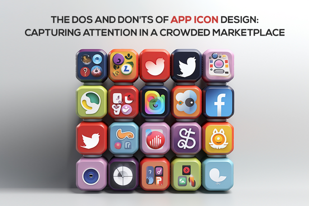
The Significance of App Icons
In the sprawling metropolis of the app marketplace, where millions of apps jostle for attention, the humble app icon is your digital storefront sign. It’s the first impression, the initial handshake, and the potential user’s glimpse into the world you’ve crafted. This article embarks on a journey through the realm of app icon design, uncovering the pivotal role these miniature artworks play in capturing the hearts and screens of users worldwide.
The First Impression: Why App Icons Matter
They say first impressions are lasting. In the realm of apps, the icon is your app’s first impression. We’ll explore why app icons matter, how they influence users’ perceptions, and why investing in their design is a non-negotiable step towards success.
Navigating the Competitive App Marketplace
The app marketplace is a crowded bazaar where competition is fierce and attention spans are fleeting. We’ll discuss the unique challenges app icons face in this saturated landscape and how they can become a beacon in the digital cacophony.
With this introduction, we set the stage for a deep dive into the dos and don’ts of app icon design, offering insights and strategies that will help app developers and designers create icons that shine in this highly competitive arena.
Design Principles for App Icons
In this section, you’ll gain a comprehensive understanding of the fundamental design principles that underpin effective app icons, including simplicity, clarity, and the importance of aligning your icon with your brand’s identity
Simplicity and Clarity
The Power of Minimalism
In the realm of app icons, less is often more. Simplicity is a guiding principle that not only enhances the aesthetics but also fosters instant recognition. We’ll delve into the art of minimalistic icon design and how it can make your app stand out in a crowded marketplace.
The Pitfalls of Overcomplicated Icons
Complexity can be the enemy of recognition. Overcomplicated icons can confuse users and dilute your app’s brand identity. We’ll explore the pitfalls of overdesigning icons and provide insights on how to strike the right balance.
Consistency with Branding
Aligning Icons with Brand Identity
Your app icon is an extension of your brand. We’ll discuss the importance of aligning your app icon with your brand’s identity, values, and visual language to create a cohesive and memorable user experience.
Establishing Brand Recognition
Consistency breeds recognition. We’ll explore how maintaining consistency in your app icon design across platforms and updates can lead to stronger brand recognition and user trust.
Visual Elements and Aesthetics
In this section, you’ll dive deep into the visual elements and aesthetics that define exceptional app icons. From color choices to the role of symbolism, you’ll gain insights on how to create icons that captivate and inform users effectively.
Color Palette and Contrast
Choosing the Right Colors
Colors can evoke emotions and convey meanings. We’ll explore the psychology of colors in app icon design and how to choose the right color palette to reflect your app’s personality and purpose.
The Role of Contrast in Visibility
Visibility is paramount in the digital realm. We’ll discuss the critical role contrast plays in making your app icon stand out, ensuring it remains easily distinguishable even in a sea of other icons.
Imagery and Symbolism
Using Imagery to Convey Functionality
Images can speak volumes. We’ll guide you on using imagery effectively in your app icon to convey its functionality and purpose, helping users instantly grasp what your app does.
Avoiding Ambiguity and Misinterpretation
Clarity is key. We’ll explore the dangers of ambiguous icon imagery and how it can lead to user confusion. Learn how to avoid common pitfalls and create icons that communicate clearly.
Incorporating Symbolism for App Categories
Certain symbols have become synonymous with app categories. We’ll delve into the use of symbolism to instantly convey your app’s category or genre, aiding users in locating it within their preferred niche.
Typography and Text
In this section, you’ll delve into the nuances of typography and text in app icons, understanding how the right font choices and text elements can enhance icon readability and user understanding.
Selecting Appropriate Fonts
The Readability Factor
Typography can make or break your app icon. We’ll explore the critical factors that ensure text on your icon remains readable across various devices and screen sizes.
Font Consistency with Branding
Consistency extends to typography. Discover how to choose fonts that align with your brand identity while maintaining readability and aesthetic appeal.
Dos and Don’ts of Text on Icons
When to Use Text
Text can enhance icon clarity, but it should be used judiciously. We’ll discuss situations where text is beneficial and when it’s best left out.
Avoiding Crowded Text and Tiny Fonts
Overloading your icon with text can lead to clutter and confusion. Learn the art of balancing text elements and avoiding the use of tiny fonts that compromise readability.
Localization Considerations
The world is diverse, and your app’s reach might extend to global audiences. We’ll explore the considerations for localizing text on icons, ensuring your app resonates with users worldwide.
Testing and Optimization
In this section, you’ll explore the importance of testing and optimization in app icon design. A/B testing and responsive design are key strategies to ensure your icon continues to capture attention in a dynamic marketplace.
A/B Testing for Icon Performance
Conducting A/B Tests for Icon Variations
A/B testing isn’t limited to app features; it’s a powerful tool for optimizing your app icon’s performance. We’ll guide you through the process of conducting A/B tests to find the icon design that resonates most with your target audience.
Interpreting A/B Test Results
Running A/B tests is just the first step. Understanding and interpreting the results is equally crucial. We’ll provide insights into how to analyze A/B test data and make informed decisions based on user preferences.
Regular Icon Updates
The Value of Iteration
The app landscape is ever-evolving, and so should your icon. Learn why regular icon updates can keep your app relevant and appealing to both new and existing users.
Responding to User Feedback
Your users can be valuable critics. Discover how to listen to user feedback and use it to refine your app icon design, making it even more compelling and user-centric.
Conclusion
This information equips app developers and designers with essential knowledge and guidelines for creating effective app icons that leave a lasting impression in a competitive digital landscape.
Your app’s icon can be its most potent advocate. By adhering to the dos and don’ts outlined in this article, you’re well-equipped to create icons that capture attention, foster recognition, and stand out as beacons in a sea of apps.
Summarizing the Key Principles of App Icon Design
App icons are the face of your digital creation, and their design should never be taken lightly. In this journey through the art and science of app icon design, we’ve uncovered the key principles that can transform your icon into a digital ambassador, one that beckons users into your app’s world.
Reiterating the Impact of Icons on User Impressions
Never underestimate the power of first impressions. App icons are your app’s handshake with users, and their design profoundly influences how your app is perceived. With simplicity, consistency, the right visual elements, and careful consideration of typography, your app icon can become a memorable and inviting portal.
Encouraging App Developers to Invest in Icon Excellence
As we conclude this exploration, the message is clear: excellence in app icon design is not an option but a necessity. It’s an investment in the success of your app, an invitation to users to explore your creation, and an opportunity to make a lasting impression in the crowded digital marketplace.
Please feel free to Contact Us in case you need any guidance regarding your app marketing needs.
How often should I update my app’s icon?
Icon updates should be considered when there are significant changes to your app’s branding or functionality. However, avoid frequent changes that might confuse users. It’s generally recommended to update your icon on a milestone basis, such as a major app release.
Can I change my app’s icon after it’s launched?
Yes, you can change your app’s icon after launch. App stores allow icon updates, but it’s crucial to maintain consistency with your app’s branding to avoid confusing existing users.
Should I consider seasonal or event-based icon changes?
Seasonal or event-based icon changes can be fun and engaging for users. However, ensure these changes don’t compromise your app’s recognizability or core branding.
What tools are best for A/B testing app icons?
There are various tools available for A/B testing app icons, including split-testing features in platforms like Google Play Console and App Store Connect. Additionally, third-party tools like Apptimize and Split.io offer advanced A/B testing capabilities for icons and other app elements.
Are there any legal considerations for app icon design?
App icons should not infringe on copyright or trademarked materials. Ensure your icon design is original and doesn’t violate intellectual property rights. It’s also a good practice to consult with legal experts if you have concerns about potential infringements.
How do I make my app icon stand out without being too flashy?
Balancing uniqueness and simplicity is key. Focus on creating an icon that encapsulates your app’s essence and functionality while ensuring it’s visually distinct from competitors. Subtle design elements, color choices, and visual metaphors can make your icon stand out without being overly flashy.


This article about app icon design was excellent. I like how you pointed out that an icon is the initial impression of the entire application, not just a graphic. The decision to download or use an app is greatly influenced by the instantaneous communication of purpose, personality, and trust that a well-designed icon can provide. I appreciate how easily and practically you broke it down.
August 28, 2025 at 5:24 pm