How Mobile App Design Affects User Experience

A successful mobile app business is so much more than simply getting a million plus app downloads, although it might seem otherwise. As an app marketing agency, we often come across cases where clients ask us to simply acquire paid users and grow their businesses. The real challenge lies in making your users stay and engage with the app.
While taking steps to ensure user retention is an ongoing process, there are certain things you can keep in mind right from the very beginning to make sure you come up with a mobile app that users love interacting with. Have a look at some of the best practices and hacks we follow to make any app marketable as a product, ensuring its success as a business.
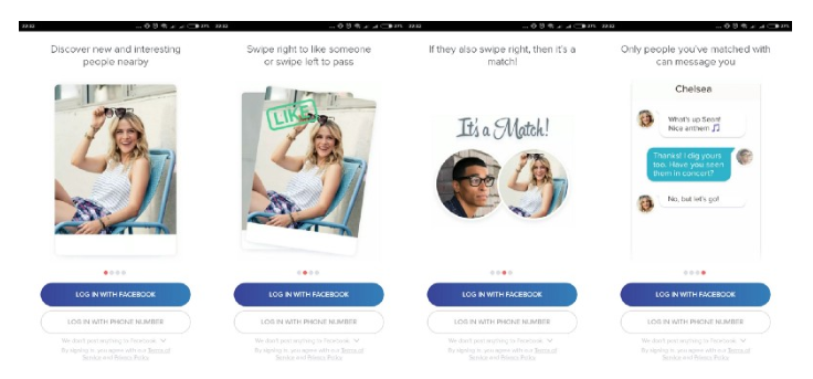
- On-Boarding Screens – The On-Boarding screen is the very first interaction you have with your user and it must leave a lasting impression. It is crucial for an app to have a value based on-boarding screen which not only connects with the user but also helps guide them through the interface of the app. Effective and short onboarding screens or tutorial videos can be used to make the user familiar with the app and to educate them about the app’s features. Having a simple tutorial or onboarding screen can uncomplicate the setup process for the user and make them feel at ease with the app’s functions.

Tinder has a simple onboarding screen which also allows the user to skip and log in at any time. Image source: uxplanet.org - Decluttering – Mobile screens have limited space and for the users to have a seamless experience, it is essential that the app is not loaded with too much information. Adding buttons and icons which are not absolutely necessary only increases the noise on the screen which can overwhelm the user. And we certainly don’t want that, do we? You can use a progressive disclosure technique to show all the information and save yourself from crowding the app screens. It also helps increase user interaction with the app. Remember minimalism is a good thing!!
- Make the app accessible- Very often, apps keep asking for various permissions when the user opens the app for the first time. This means that the user has to spend valuable (and crucial) time in accessing the core functionality of the app. Making them wait to access the main app can frustrate the user and can lead to user dropouts. Also, it is likely that the user will deny permission, if they don’t have enough context of the app and if it is not obvious to the user why the permission is required. It is also crucial that the app is responsive and doesn’t take too much time to onboard the user. To engage the user better, the app can use skeletons to emulate a sense of loading.
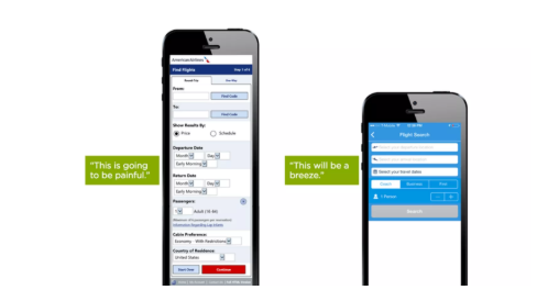
Lengthy and complex forms or tasks which require users to take any cognitive load are a no-no. Good mobile app design should minimize user effort. Make the design efficient, set default choices, use available data as far as possible. This not only reduces decision making but also fastens the processes the user has to go through to use the app. Using structured forms and providing necessary assistance to the user with features like autocomplete, input masks, dynamic field validation and customer keyboards reduce the propensity for errors.

Image Source: ThinkWithGoogle
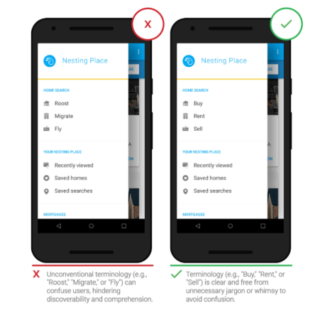
- Avoid using jargons – Using complicated language and unfamiliar terminology can often confuse the user. Using words which the user uses in day to day communication and screens which are common to most apps help the user become more comfortable with the app. Self-explanatory language enhances the user experience and allows them to interact with the app with more transparency.

Image Source: ThinkwithGoogle
- Use Native Icons, Buttons & Gestures- Standard and predictable UX makes the user feel like they know the app and are in control of what’s happening. Using native OS icons & gestures and in-app experiences is a good practice and is essential to reduce the energy spent by the user in navigating through the app & understanding it. However, using custom gestures should be avoided. The visual elements of the app should be indicative and effectively communicate the function it serves to avoid confusing the user.
- UX must be mobile specific- Mobile app design should be consistent with the web service but it should not replicate the experience. The expectation of a user from an app is very different from that of a web service, in terms of design, interface and interaction. Trying to copy web experience to an app can hamper usability. For instance, hyperlinks can be avoided, use buttons instead! Being taken to the mobile web can be incredibly annoying for anyone trying to experience the app. Many times users can leave the app and even uninstall because of this small “inconvenience”. If the app requires the user to view some content or provide data via the browser, use the in-app browser instead of redirecting the user to the phone browser.
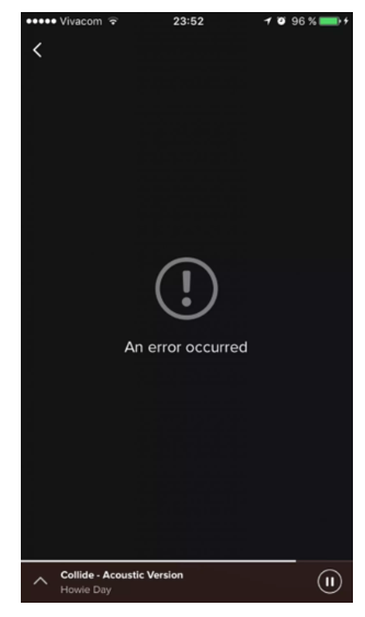
- Communicate effectively- Never take for granted that the user is tech savvy. Communication should always be descriptive and simple for users to understand. Sometimes, users may come across errors and app crashes because of user mistakes or technical glitches, it is important to let the customer know in simple language what the issue is and what the next steps are. Don’t leave the user hanging.

This error screen from Spotify is a dead end and doesn’t tell the user what to do.
Image source: Smashing Magazine
- Allow sufficient time for feedback – A decent part of an app’s success can be attributed to the reviews and ratings it gets. It helps promote the app and also gives an insight to the potential user about what they can expect from the app. This makes it obvious that reviews and feedbacks are important but asking the user for a review after they use the app for the first time is not suggested. The user should be allowed to spend some time experiencing the app. It is more likely that they will give a more useful feedback once they’ve used the app for long enough. For example, wait for the user to complete a task while using and then ask for a rating. Having a positive experience with the app will make them want to give feedback.
There are innumerable apps which people use in their everyday life and to make the user continue using your app, it is important to make an app which is both aesthetic and functional. Regular testing and evolving is needed to make an app which meets user expectations and is successful as a business.
Looking for an in-depth product analysis of your upcoming mobile app? Write to us at sales@studiomosaicapps.com.


I found it quiet interesting, hopefully you will keep posting such type of nice blogs Keep sharing. thanks.
May 19, 2022 at 7:14 pm